
Looks Are Everything (When It Comes to Book Covers)
How to end up with a good cover--& how I ended up with mine

A book has to pass several checks in order for me to take it home from a bookstore. The decisive one is the writing check: I flip to a random middle page and start reading. Authors usually aren’t quite as self-conscious by the time they hit page 150 or so, and I get a better sense of their actual style from the in-the-groove middle pages than I do from the hyper-wrought opening paragraph.
Before the random page check, though, the book has to make it past an earlier check: the jacket copy check. I’ve written a lot of jacket copy, and I know it’s not always to be trusted, but I do make sure to skim the jacket copy to see what the publisher thinks the story is about. It’s an easy way to screen out books that rely on tropes or story formats that generally tend to annoy me.
Before either of these checks—before I ever bother to pick up a book and read the jacket copy or the interior—there’s a first check that a book has to pass: the cover check. The way I do this is not systematic at all. I just scan the bookstore for any covers that seem interesting, and then I pick out those books to investigate further.
If a book has an interesting cover, I’ll give the jacket copy a chance, and if that doesn’t actively put me off, I’ll give the writing a chance too. If a book has a bad or boring cover, I probably won’t even notice the book—I won’t wonder what it’s about, and I won’t read a word of the author’s writing.
So what actually separates the Books I Might Buy from the Books I Will Never Buy is the design of the cover. Not the writing, which I’m equipped to evaluate, nor the jacket copy, which I’m likewise equipped to evaluate, but the artwork on the front of the book, which I evaluate only subconsciously and can’t begin to articulate my preferences about.
With all this in mind, I was rather anxious going into my first cover meeting with my publisher. I felt that the design of my novel’s cover was both make-or-break and utterly beyond my control—because, even if McSweeney’s had granted me full veto power over the cover design (which never happens with any publisher), I had no idea what I wanted and no language with which to express it.
During the meeting, the design team asked me questions like: “What fonts do you gravitate to?” (no idea), “What color palette are you envisioning?” (no idea), and “What illustration styles do you like?” (they have names?). I was also asked if there were any recurring objects or settings in the novel that might serve as a jumping-off point… but since the novel prominently features two bakeries, a farmer’s market, a distillery, and a coffee shop, the output of our brainstorm was beginning to sound rather like the cover of a cookbook.
At some point in the meeting, I realized that I was not being particularly helpful on the visual front, and I decided to pivot to talking about the novel’s themes. I went on a long rant about what I think the novel is about, which is decision-making, and how decisions are never really permanent, because if you decide to stick with something then you’ve got to keep making the decision to stick with it every single day from then on out, and if you decide to leave then you have to keep deciding every day thereafter not to go back, and if you decide to quit then you can always relapse, and if you relapse then you can always still decide to quit, and doesn’t it all sound exhausting and brave and maddeningly in flux when you think about it like that?
I’m not sure my speech entirely cohered, but I’m very glad that I switched to talking about theme instead of content. McSweeney’s ended up (rightly) ignoring all the other stuff I said about bread and coffee and focusing instead on the visual cues of decision-making. We talked about stairs, crossroads, precipices, reflections.
A couple months later, McSweeney’s came back to me with a concept for a cover that was unlike anything we’d talked about in the meeting. The concept was: a cover with a built-in wheel. You spin the wheel, and the characters cycle through different stages, staying and going and staying and going.
I was thrilled with this cover concept, for several reasons:
It’s different. I’m a literary writer trying to stand out among hundreds of literary writers, some of whom have loyal readers, big marketing budgets, and/or widespread name recognition. A cover with a literal wheel in it is something you’ll notice on the shelf, even if you’ve never heard of me before. I think it’s a huge advantage to have a cover that does something different from the masses.
It fits the book. How do you convey, purely via visuals, the fact that my novel features an omniscient narrator, an ensemble cast, and themes of indecision and impermanence? If anything can get all that across at once, it’s the wheel. The wheel insists that no one character is the main character; that all of them are equally worthy of study; and that none of them will ever reach a state of perfect stasis. As they say on Tumblr: The themes are theming.
You can fidget with it. I love to fidget with things. My boyfriend and I keep a designated Emotional Support Paperclip on our writing desk so that we always have something to fidget with while we’re working. (Sometimes I fidget a little too hard and break the paperclip, and then we have to replace it.) As soon as McSweeney’s floated the concept of a cover with a wheel in it, I imagined a room full of people at a bookstore event, happily messing with the wheel as they half-listened to me reading up on stage. This seems like the ideal scenario for a reading. Give the people something to do with their hands!
I expressed my total approval of this direction for the cover (and my relief that we were not designing a cookbook). Another couple months passed, McSweeney’s asked me a few more questions about the setting and characters, and then at last they sent me the final draft:
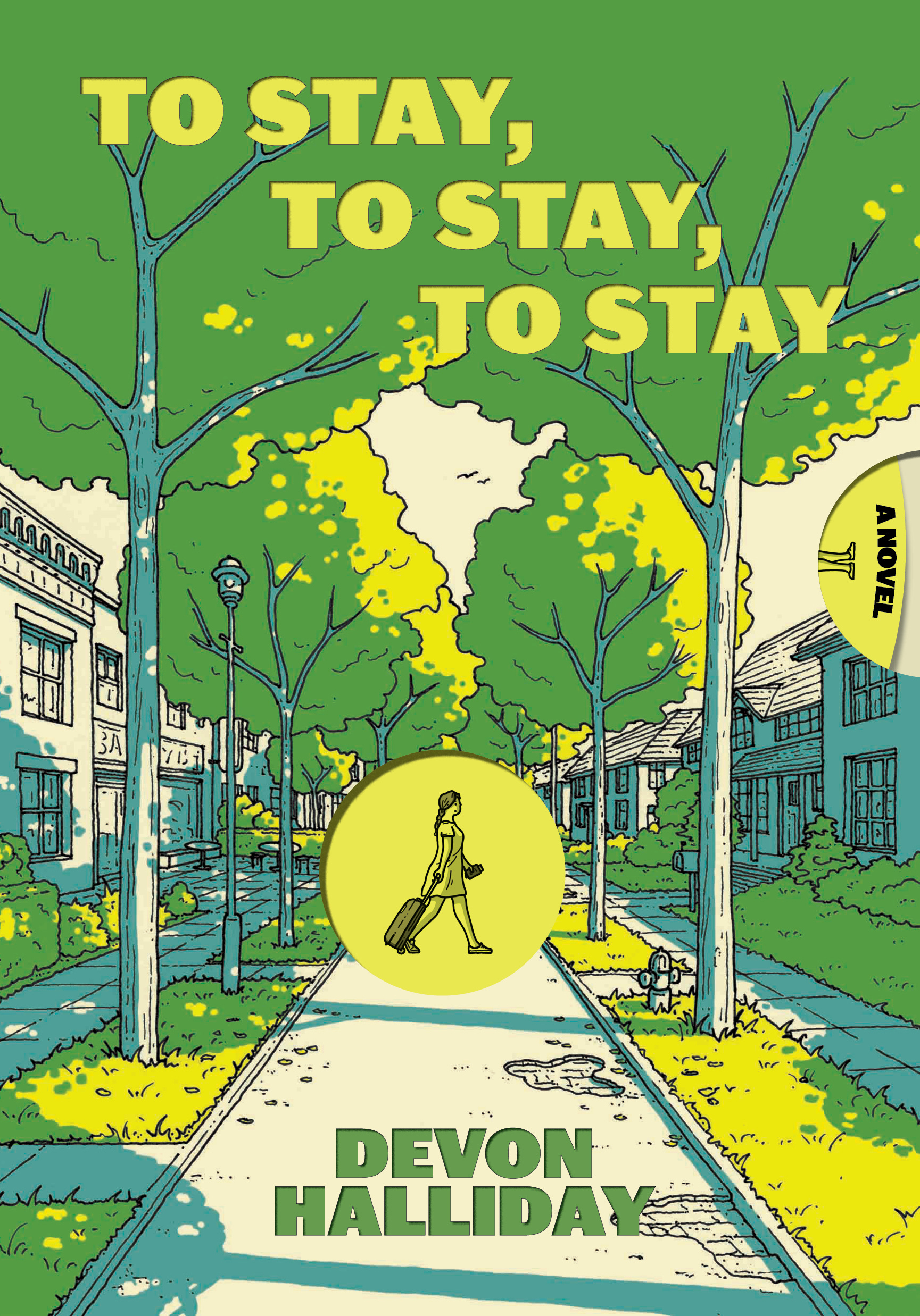
I’m really excited about this cover, not just because it has a fucking wheel in it (!!), but because the other elements perfectly capture how the book should feel to read. McSweeney’s got the color palette right, the font, the illustration style, and all without me ever managing to express an opinion about any of those factors.
So now that I’ve gone through this process a total of once, here are some off-the-cuff takeaways that may be useful to you now, or to me the next time I get to do this:
Know what your book is about, not just what it’s about. (More about that distinction here.) A clear pitch about your novel’s themes might give rise to a more creative cover than a pitch that focuses on your novel’s content.
If you don’t have opinions about the visuals of the cover, don’t fake them. I think that if I had come out swinging in favor of some color or font choice, I would only have limited the designer’s options when creating the cover. Limiting options isn’t a bad thing if you have really strong preferences, but I had no preferences and I’m glad that I didn’t box the designer in.
At each stage of the process, recognize which aspects of the draft are essential vs. incidental. When McSweeney’s first sent me the wheel idea, they included a mock-up of how the cover might look. I didn’t really like the illustration style or the color choices of the mock-up… but I intuited that those were not the point of this draft. The point was to get us all on the same page about the wheel idea, and the colors and illustration and etc. were all in flux. So I didn’t send any notes about the illustration, just gave my thumbs-up on the wheel concept. By the time I saw the next draft, the colors and illustration had radically shifted. I’m glad I didn’t waste any capital with the designer nitpicking about the color of the trees in the mock-up.
Involve your agent. Agents are happy to be the “bad guy” in these scenarios—so if you’re really unhappy with the direction your cover is headed, let your agent be the bearer of bad news. Their job is to preserve the good feelings between author and publishing team, which means your agent will gladly fall on the sword and say: “I just really hate that shade of pink”—so that you can meekly chime in and say, “To be honest, I didn’t love it either.”
Extend the benefit of the doubt. It is so hard to trust people to do things that are important to us—and here, you’re trusting a team of strangers to create a face for your book, a face that may determine whether anyone ever reads the book. The stakes are high. But as much as you can, assume good intent and careful thought on the part of your publishing team. Everyone benefits from a good cover—this process should not feel adversarial. (If it does, make sure that energy isn’t coming from you.)
Debutiful announced my cover yesterday, and shared a Q&A about how the cover came to be, including what I originally thought it would look like and what tone I think the cover conveys. Soon (thanks to my hardworking publicist) there shall be more essays, articles, thinkpieces, Q&As, listicles, interviews, and miscellaneous posts about the novel than you could reasonably want to read, but I’ll link to them anyway as they come out.
The novel is also now available for pre-order at Barnes & Noble, Bookshop.org, and McSweeney’s! I think it can be pre-ordered through various local indies too, though I should check and make sure that’s true before announcing it.
You’re probably thinking: why would I pre-order a novel without even the chance to flip through the middle pages, performing the all-important “writing check”? But keep in mind:
the cover has a literal wheel in it (!)
the novel is about decisions—I bet you’ve made at least one of those in your life
the omniscient narrator of my novel sounds a lot like the omniscient narrator of my substack, so you’ve kind of already met her
If you want to know more about the novel, I’ve set up an anticipatory FAQ on my website, answering such questions as “What’s the novel about?” and “Has anyone said anything nice about it yet?”
If you don’t want to know more about the novel, look forward to next week’s post, where instead of talking about my own novel I will be venting (usefully) about other people’s novels.
Thanks for reading!
Excellent post! Thank you.
Coming from a design background, if my cover team began with “what fonts/colors/art styles do you like?” I’d be more than a little dismayed. It’s not the job of a non-designer to understand those things…and it’s not the job of a designer to give a client what they *want.* As in a well-written book, the protagonist needs to get to what they *need,* and it’s the designer’s job to guide them there. Your pivot to theme was exactly how I always started with a new client: “explain to me what you want a customer to feel.” I’d have hoped that they would have started there, moved onto visual symbols from the story to help convey those feelings, resulting in “here are fonts, colors, illustration styles, designs that convey that feeling” along with “we understand the marketplace; this design will help you stand out from the crowd…here’s *why.*”
A designer’s job isn’t about what it’s about. The visuals they produce — like the visual symbols in a story — are simply the outward expression of underlying themes: technical mastery and market expertise, certainly…but even more important, empathy and understanding.
Really thrilled for you that you landed with a great cover.